Dundee Design Festival
What's on?
- THANK YOU! to every single person who walked through the doors of West Ward Works for the second amazing Dundee Design Festival. Click the link to see photos on Facebook! — Find out more ›
About
It’s hard not to notice that Dundee is whirring with creative energy right now. It’s an exciting place to be, and it’s a privilege to be able to invite some of the world’s leading designers and thinkers to our city to share their amazing ideas for an extended five-day festival at West Ward Works.
About the festival
West Ward Works was home to the printing and binding of DC Thomson’s best-loved comic book annuals for over sixty years. Beezer, Twinkle, Black Bob, Sparky and Topper were all produced here before the factory closed its doors in 2010. The factory has since been emptied of its machinery. In 2016, the cavernous spaces of the old building were transformed into the home of the first ever Dundee Design Festival.
The theme for this year’s festival is Factory Floor through which we celebrate and explore makers, machines, and the future of manufacturing.
We’ve drawn inspiration from Dundee’s illustrious yet complex industrial heritage and the extraordinary festival venue itself to describe what making means now. Across three enormous galleries, we present a programme of design-inspired exhibitions, talks, film screenings, live performances and family events.
You can expect to experience an assembly line of creative activity at West Ward Works. Try out new techniques at one of our many drop-in and ticketed workshops, including plaster casting, ceramic mould making, and carving jewellery.
This year’s festival is all about making, so we invite you to don a smock, roll up your sleeves and try something new.
Getting to the Festival by Road
For traffic coming from Edinburgh (M90), Glasgow (A9), follow the M90 to Perth then take the A90 for Dundee, follow signs for city centre and when you reach the railway station take the left turn off then follow the road through 3 sets of traffic lights and left at the next roundabout, when you reach the next roundabout take a right, then take the 1st exit onto Horsewater Wynd. Turn right onto Guthrie St and West Ward Works is on your left.
From Aberdeen follow A90 to Dundee and follow signs for city centre until you reach the roundabout by the railway station then follow above directions.
West Ward Works is approximately three miles from Dundee Airport. Dundee Airport charters flights to and from Dundee between London Stanstead & Jersey airports and is situated only five minutes from Dundee City Centre. Flybe/Loganair operates a twice daily service to London Stansted at convenient times to suit business & leisure travel requirements.
Dundee is a main line station on the UK east coast line and has direct rail links to London and the continent. London is only six hours away by train and there are regular daily services that go direct to many parts of the country.
West Ward Works is approx 15 mins from the Railway Station.
Our Sponsors
Brand Story
Re-visiting your work isn’t something that happens often, so to come back again to refresh the Dundee Design Festival identity this year was an interesting opportunity.
The first years identity was developed as a woven pattern using the factory’s surrounding shapes and the colour palette from the printing presses that once resided within the space at West Ward Works.
This year’s festival looks more generally at the factory floor and production within design, and for me that was good opportunity to evolve the ideas started last year rather than start from scratch.
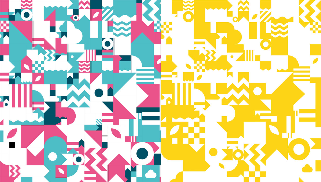
2016 Design Festival Pattern (left) and the reworked pattern for 2017 (right)
Moving things forward typographically
One of the areas that I felt was lacking the previous year was the typographic design work. I focused heavily on pattern and creating a pattern that would be recognisable throughout the festival that, in many ways, type was a bit of a distraction and inconvenience to the visual identity.
So for this year I wanted to swing that around and focus on type and how the pattern could evolve into a visual language. This began with looking at the shapes that were there and how these could be reconfigured to provide the foundations of letterforms.
I experimented with different levels of detail eventually settling on a minimal approach with each letterform made from 2 elements that took the legibility as far as I felt it was safe to go within the context of the eventual use.
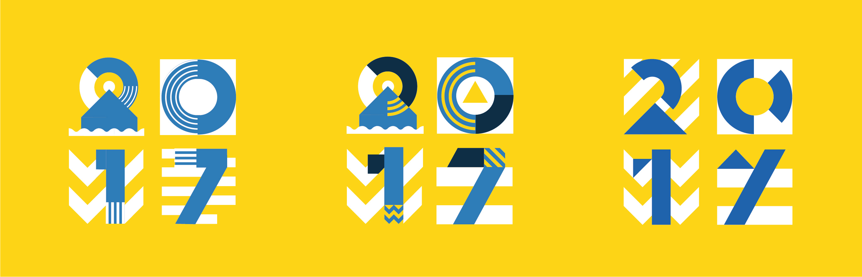
Development process of the 2017 identity letterforms
Choosing the right colour palette is very important to the overall design
For any identity project choosing the right colours is as much part of the design process as typography and visual design. Unless you are beginning the identity from scratch then most projects will already have a colour palette in place and sometimes a strong identity design can carry more than one colour palette option.
For the Dundee Design Festival, with it’s them based approach to the content, it made sense to approach the colour in the same way and look at how it could be used to reinforce the Factory Floor concept.
There is something really industrial about blue and yellow as a colour palette and once you see that association you begin seeing it everywhere! So this was easily the colour palette choice for this year. For me it was the yellow of the markings on factory floors and the blue of boiler suits, but it could easily have been the yellow of the machinery and the blue of the safety signs.
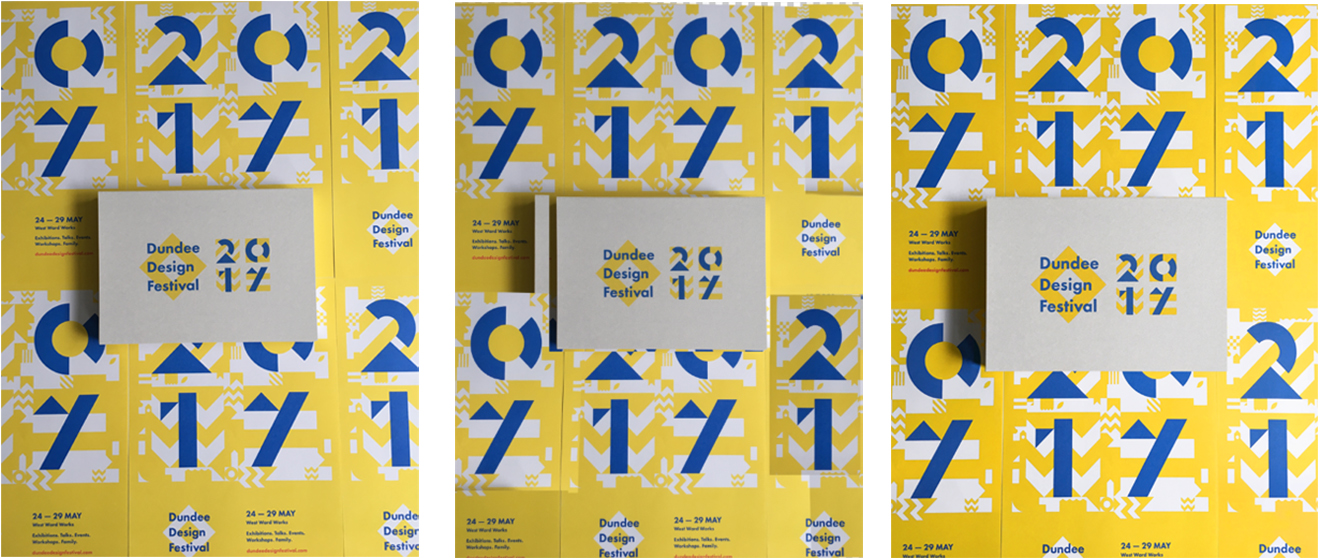
Application of the design ranged from posters through to screen and the colour had to work as spot colours, CMYK and RGB and the design had to be flexible enough to work across print, screen and for installation within the space.
Presentation needs to be considered carefully
Process of creating images for promotional use – original image (left), Photoshop in progress (centre) and final image (right)
I was working on the promotional imagery quite quickly as the turnaround between completing the print runs and getting media coverage was small – we literally had to photograph on a smart phone and use photoshop to tidy the results.
Some of the images needed just simple colour and contrast tweaks and others needed a more intensive revisions. The most codex image was the combined image showing the invitations that were printed on GF Smith Gmund Urban Concrete card and the posters. The image that was sent to me was a nice composition but had lots of small areas that needed tweaked – this resulted in a complex photoshop adjustment with the shadow being cast the hardest thing to work around, you can see this in the image sequence above.
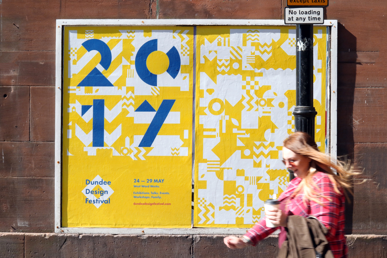
The exciting part of any identity design is seeing it in the wild and hearing people’s feedback. If you want to explore more of the design work that went into this years identity you can visit my project page on Behance or on my website.
There is also this article written by Creative Boom and you can access all the design elements over here if you want to experiment with the design yourself, or just look at how the digital files are constructed.
Design work for this project was created using the Adobe Creative Suite – particularly; Illustrator for all vector drawing, InDesign for poster layouts, Photoshop for image manipulation and Animate for motion graphics.